The Artist · Craft
Every foundation match, every corrector and every lipstick choice is a color decision. Color theory makeup skills turn those decisions from guesswork into judgment. This guide, part of the hub for professional makeup artists, covers the color wheel, undertones, color correcting, foundation matching and the light that changes all of them.
It is written for working and training artists in the US, and it assumes you already know your products. Here, the goal is to explain why they behave as they do.
The short answer
Color theory in makeup is the use of the color wheel to choose and adjust shades. Opposite colors neutralize each other, so green corrects redness and peach or orange corrects blue-toned shadows. Undertone, meaning cool, warm, neutral or olive, guides foundation, blush and lip choices. Light changes everything, so check work in the light the client will be seen in.
In this guide
Color theory makeup basics: the color wheel
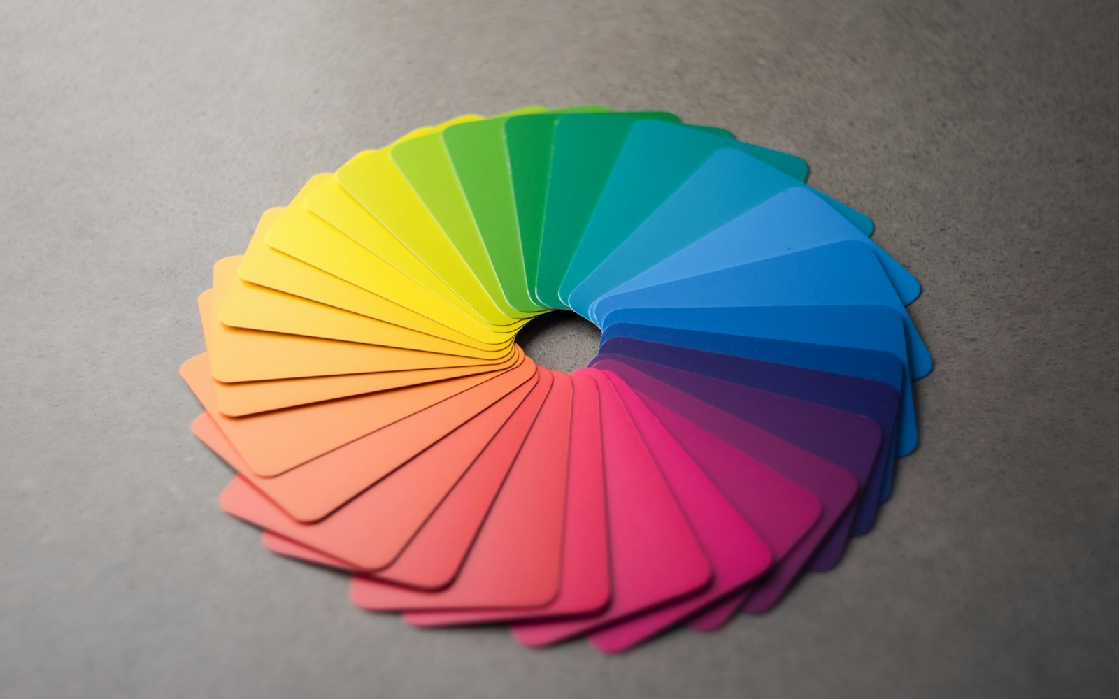
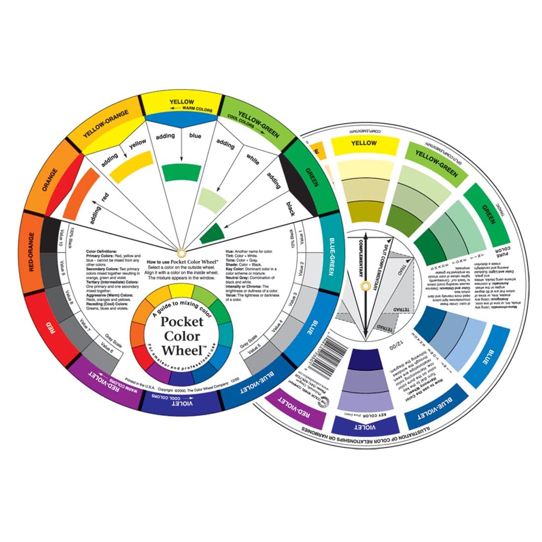
The color wheel arranges hues in a circle. The primary colors of pigment are red, yellow and blue. Mixing two primaries gives a secondary color: orange, green or violet. Mixing a primary with a neighboring secondary gives a tertiary color, such as red-orange or blue-green. Beyond hue, every color also has value, meaning how light or dark it is, and saturation, meaning how intense it is. In practice, most color problems in makeup are problems of value or saturation rather than hue. A foundation that looks gray is usually too cool or too light, not the wrong color family. Consequently, learning to name what is wrong, whether hue, value or saturation, is the first step to fixing it quickly on set.
Complementary colors
Colors opposite each other on the wheel are complementary. According to the Colour Literacy Project, mixing complementary paints produces a near-neutral gray. That is the principle behind color correcting: a thin layer of the opposite color neutralizes an unwanted tone before foundation goes on. Placed side by side instead of mixed, complementary colors do the opposite and intensify each other. That is why copper eyeshadow makes blue eyes look bluer. The same rule therefore explains both correction and emphasis, which is why color theory makeup training starts with the wheel. Once you see the wheel in every decision, products stop being a list of shades and become a set of tools.
Makeup undertones explained
Skin has a surface tone, which is how light or deep it looks, and an undertone, which is the hue beneath. Undertones are usually described as cool, warm, neutral or olive. Cool skin leans pink, red or blue. Warm skin leans yellow, peach or golden. Neutral skin sits between the two. Olive skin has a green or gray cast that makes many foundations look either too pink or too orange. In color theory makeup terms, undertone and depth are independent: fair skin can be warm, and deep skin can be cool. As a result, a shade range that only varies depth will fail many clients. Professional ranges and mixing palettes vary undertone as well, so artists can match both dimensions.
How to read an undertone
Artists use several quick checks. Look at the skin beside a pure white towel and an off-white one, and notice which looks more natural. Check the jawline and neck in daylight, where the face often has redness the neck does not. Then test two foundation stripes, one cooler and one warmer, along the jaw. The one that disappears tells you the undertone faster than any rule.
Olive and neutral skin
Olive skin is the undertone artists most often misread. Many shades that match its depth look pink or orange on it. Mixing a little yellow or green-leaning foundation into a neutral shade usually solves the problem.

You may also like
What Is Makeup Artistry? The Craft, the Career and the Mindset

You may also like
The Best Makeup Books for Makeup Artists
Undertone also shapes every color choice after foundation. Cool skin usually suits blushes with a pink or berry base, while warm skin suits peach, coral and apricot. Neutral skin can wear both, and olive skin often looks best in muted roses and terracottas that do not fight its green cast. The same logic applies to lips and to bronzer, where a bronzer that is too orange reads as fake on cool skin. Of course, these are starting points, not rules. Clients choose looks for many reasons, and part of the craft is making an unexpected color work. Even so, knowing the undertone tells you how much you will need to adjust. Write it on every client card, because it saves time at every future appointment.
Color correcting makeup
Color correcting means using a corrector of the opposite color to cancel a discoloration before foundation. It works because complementary colors neutralize each other. The skill lies in choosing the right shade and using very little. Too much corrector shows through foundation as a gray or colored patch, which is worse than the original problem. Apply corrector only where it is needed, blend the edges until they vanish and let it set before adding foundation. Meanwhile, match the corrector’s depth to the skin. Pale peach suits fair skin, while deeper orange and red correctors suit medium and deep skin. The chart below shows the common pairings artists use, from green for redness to lavender for sallowness.
You may also like
The 120 Best Makeup Schools in the World
You may also like
Makeup Artist Portfolio: How to Build One That Books Work
| Discoloration | Corrector | Why it works |
|---|---|---|
| Redness, rosacea, blemishes | Green | Green sits opposite red on the wheel |
| Blue or purple dark circles, fair skin | Peach or pink | Peach neutralizes blue on light skin |
| Dark circles or hyperpigmentation, medium to deep skin | Orange or red | Deeper orange neutralizes blue-gray on deeper skin |
| Sallow or yellow cast | Lavender | Violet sits opposite yellow |
| Mild purple bruising or veins | Yellow | Yellow sits opposite violet |
Correctors on set and in effects work
Correctors are not only for beauty work. Film artists use them to cover tattoos and stubble shadow, and effects artists use the same wheel in reverse to create bruises that change color as they heal. Our guide to a special effects makeup career covers that side of the craft.
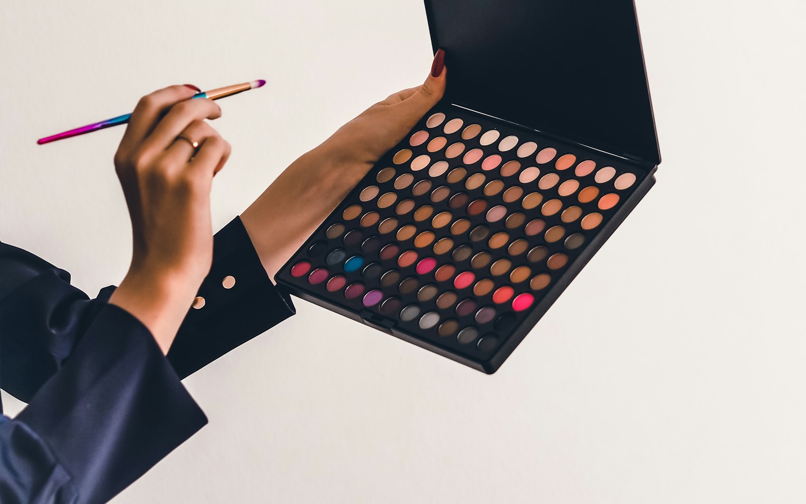
A professional kit usually carries correctors in two forms. A cream wheel or palette gives you several shades in one place, so you can mix the exact strength a client needs. Meanwhile, a few single-shade sticks or pots are quicker for touch-ups during a long day. Many artists also keep a small printed color wheel in their kit, which is useful when teaching assistants or explaining a choice to a client. Choose correctors with enough pigment to work in a thin layer, because thin layers are the whole secret. Test each shade on a range of skin tones before relying on it for a paid job. Finally, clean the palette surface between clients, since cream products are easy to contaminate.
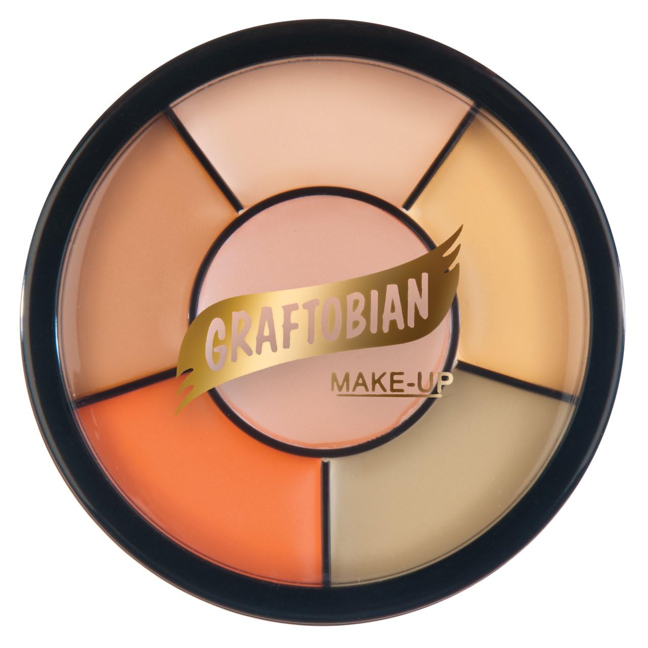
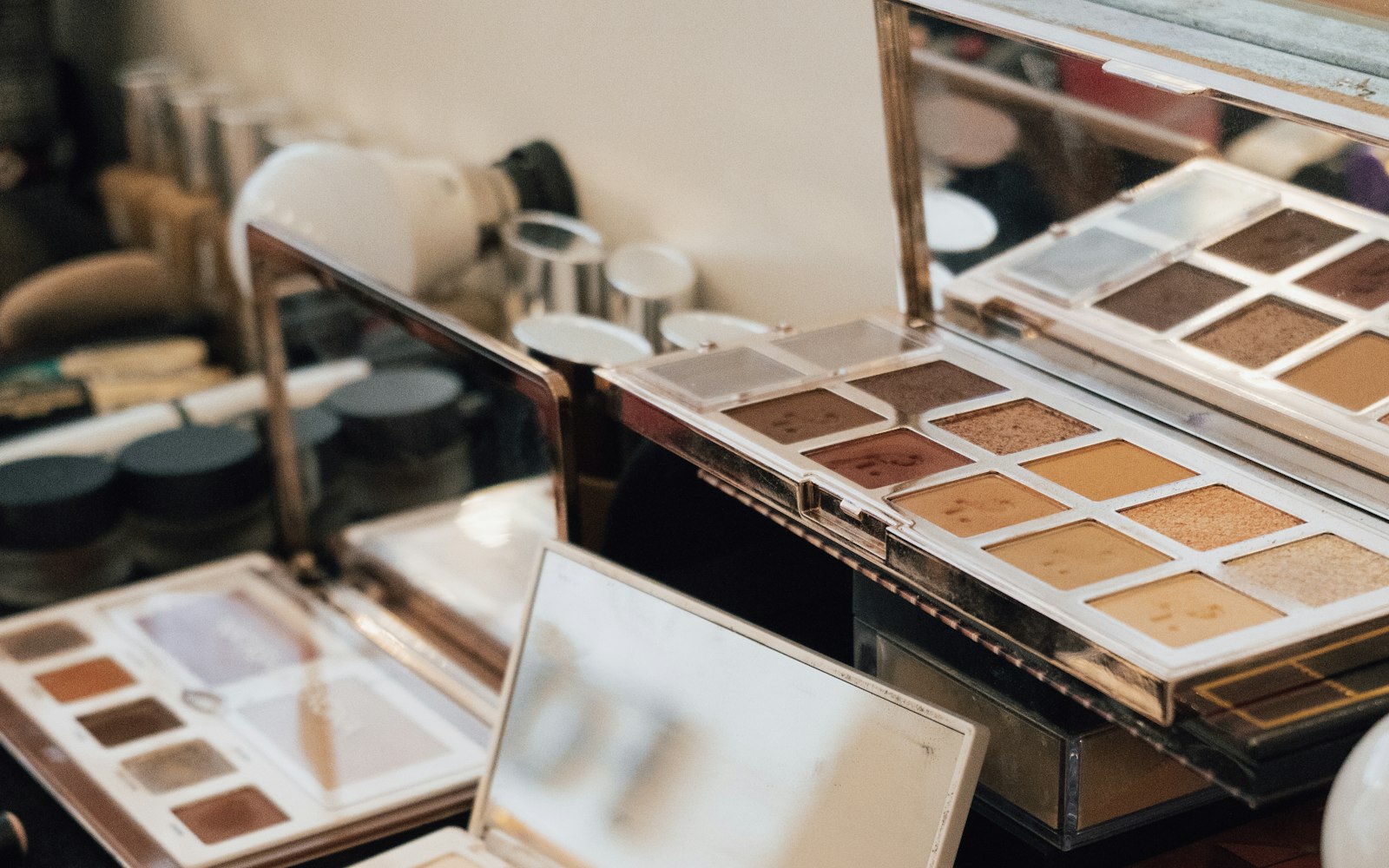
Full-coverage correctors in one professional wheel.
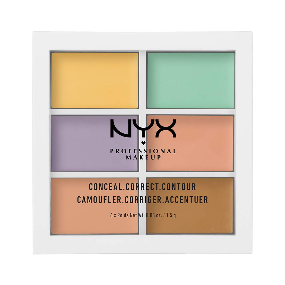
Green, lavender, yellow and peach in one compact.
With correctors in place, the next decision is foundation, and that is where most color theory makeup mistakes become visible. A corrector that is right for the discoloration can still be wrong for the foundation that follows it. For example, heavy green under a warm foundation can leave the skin looking gray. For that reason, judge the corrector and foundation together, not separately. Apply a little foundation over the corrected area before committing to the whole face. If the area looks flat or ashy, use less corrector or switch to a warmer shade. In short, correcting is a balance, and the finished skin is the only test that matters. Judge it in good light, at arm’s length and up close.
Matching foundation with color theory
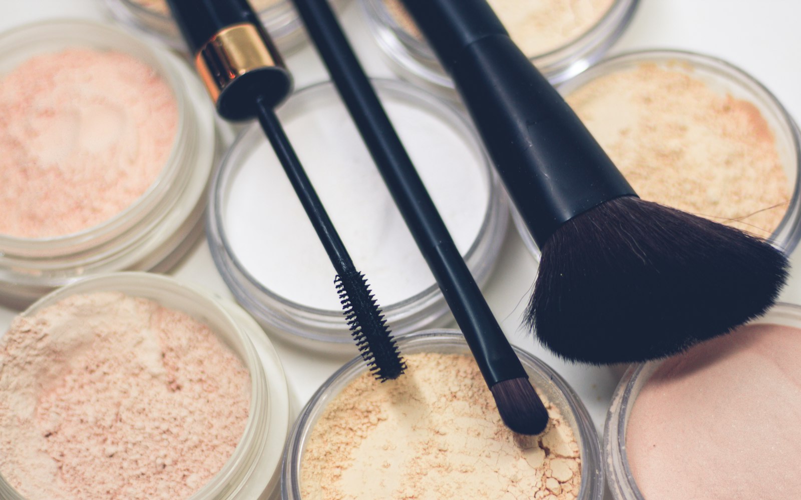
Foundation matching combines everything above: depth, undertone and light. Start by choosing two or three shades that match the depth of the jaw. Then swatch them in stripes from the cheek down to the jaw and check which disappears in daylight. Remember that many foundations oxidize, darkening or warming slightly as they dry, so judge the match after a few minutes rather than straight away. Check the neck and chest too, especially for bridal and editorial work where they will be photographed. If no single shade works, mix two. Most professionals mix foundations daily, adjusting undertone with a drop of a yellow or pink-leaning shade. Record what you mixed, so you can repeat it.
Mixing custom shades
Keep a small set of mixing tones in your kit: a yellow, a red or pink, a white and a deep brown. With those, you can adjust almost any foundation in undertone and depth. Mix on a clean palette, not the back of your hand, and note the ratio for the client card.
Matching also needs a word about setting powder, which can change a good match. Translucent powders can look white in flash photography, and tinted powders shift color on the skin. Meanwhile, a powder that is too warm can turn a neutral match orange under bright light. Test powders over foundation, not on bare skin, and check the result on camera before a shoot. In addition, keep a few shades of pressed powder for touch-ups, so you can match the base through a long day. Our list of makeup books for artists includes several titles that cover skin and color in depth. One of them is worth singling out, because it is devoted entirely to color.
Color Theory for the Make-Up Artist — the standard reference
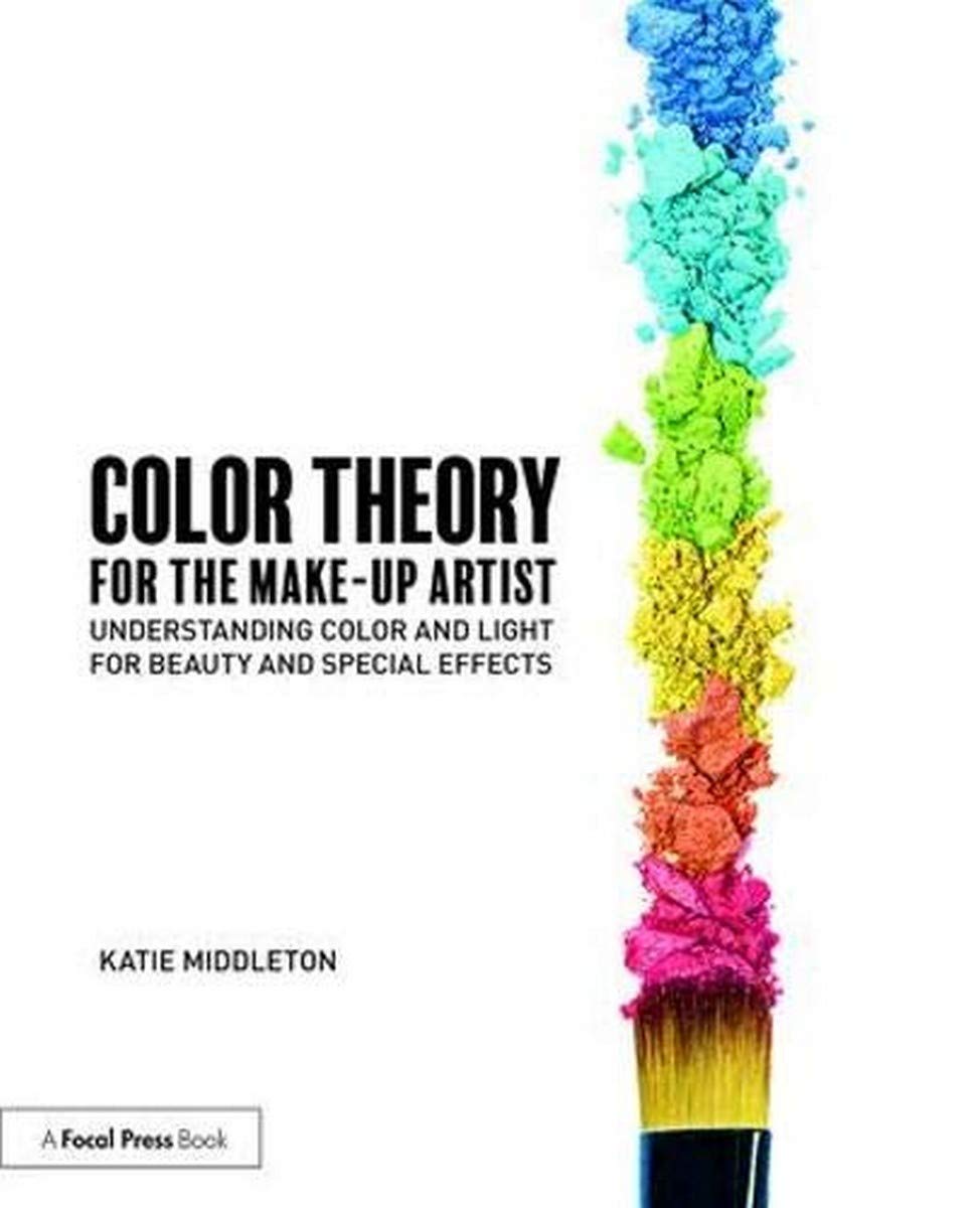
Katie Middleton’s book, published by Routledge, covers color and light for beauty and special effects work, from the wheel and undertones to mixing and lighting. It is written for working artists rather than painters. Checked on Amazon on 28 October 2026 at $21.24 in paperback, in stock.
How light changes makeup color
No color decision is complete until you know the light. Light has its own color, measured in kelvin. According to ENERGY STAR’s lighting guide, a lower kelvin number means warmer, yellower light, and a higher number means cooler, bluer light. Household bulbs commonly run from warm white to daylight. Consequently, makeup matched under warm indoor light can look pale and pink outdoors, while makeup matched in cool light can look orange indoors. Always ask where the client will be seen: a candlelit reception, an office, a beach or a studio. Then match in light that is as close to that as possible, or in daylight as a neutral reference. A daylight-balanced lamp in your kit gives you a consistent reference wherever you work.

Camera and flash
Cameras add their own complications. Flash can bleach the face and reveal white casts from some powders and sunscreens. Meanwhile, high-definition video shows texture and uneven correction clearly. Whenever possible, check the look on the photographer’s screen after the first few frames.
Lighting your workstation
Your own light matters as much as the client’s. Lighted mirrors are often warm, which makes skin look healthier than it is and leads artists to under-correct. Choose bulbs that are daylight-balanced, or check your work by a window before finishing.
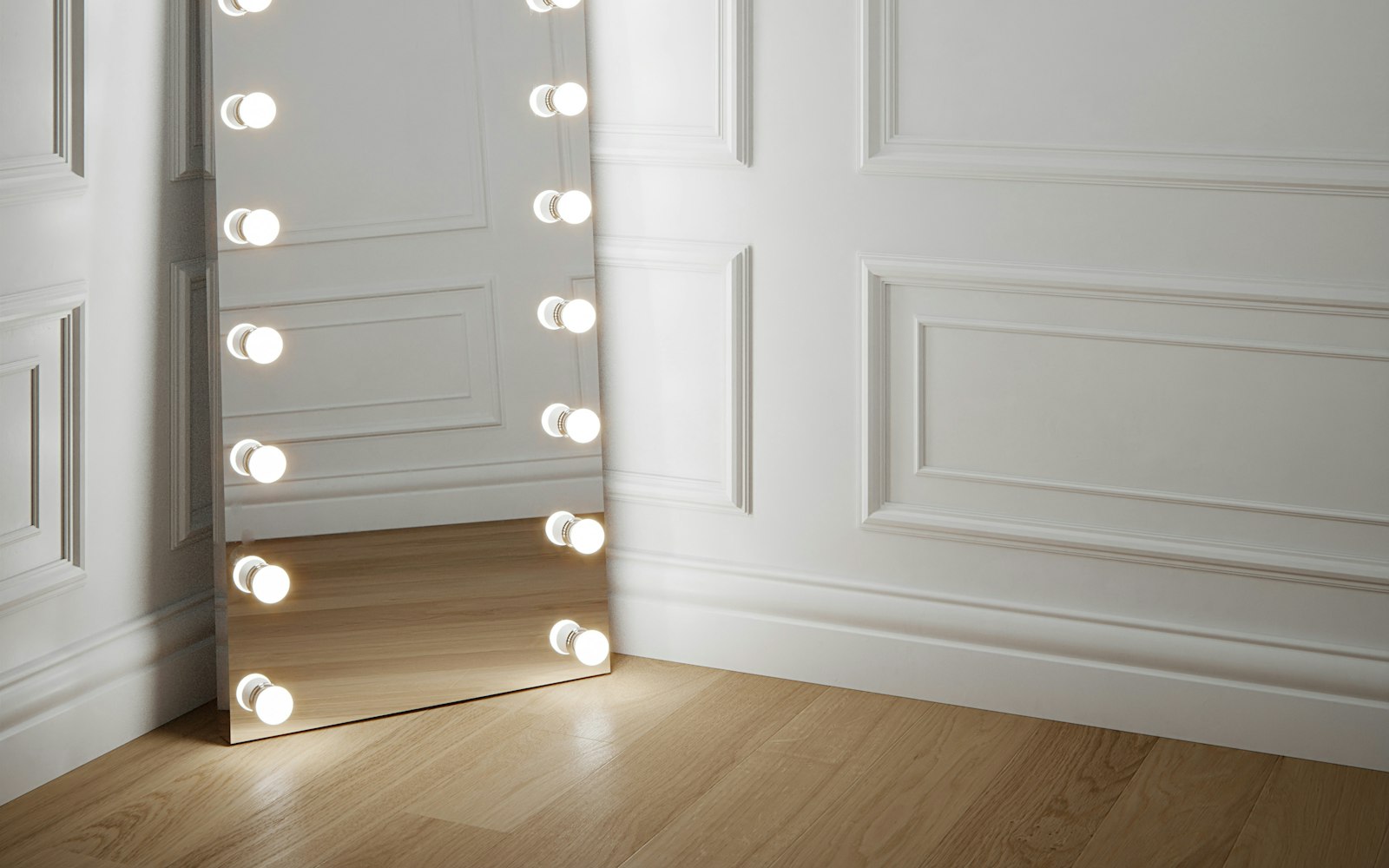
In practice, many experienced artists carry their own light for exactly this reason. Venues, hotel rooms and backstage areas almost never have the light you need. A consistent, daylight-balanced source lets you match the same way every time, which makes your results predictable. It also helps you explain choices to clients, because they can see what the camera or the daylight will see. If you only change one thing after reading this guide, make it your light. Good color decisions depend on it, and no product can compensate for a room that lies about color. Then, when you do move to another room, you will know what to expect.
Sources
Sources
Color theory for eyes, cheeks and lips
Color theory makeup choices for features follow the same two rules: complements create contrast, and neighbors create harmony. For eyes, a shade opposite the iris color intensifies it. Copper and bronze brighten blue eyes, plums and violets lift green and hazel eyes, and most colors flatter brown eyes, especially blues and golds. For a softer effect, choose shades next to the eye color on the wheel instead. For cheeks and lips, start from undertone and then adjust for the look. Finally, balance the face as a whole: one strong color usually reads as more polished than several competing ones. That restraint is part of what separates professional work from enthusiastic work.

You may also like
Special Effects Makeup Artist: How to Build an SFX Career in the US

You may also like
How to Become a Bridal Makeup Artist
Each specialty uses color theory a little differently. Bridal artists focus on long-wearing, flattering color that photographs well in mixed light. Editorial artists push color further, using complements deliberately for impact. Meanwhile, film artists think about continuity and the camera, and effects artists use color to create bruising, illness and aging. Whatever your specialty, the wheel is the same, and practice is what makes it automatic. Swatch new products against the wheel, test them on many skin tones and keep notes. Over time, those notes become your own color reference, more useful than any chart. They also make it far easier to train an assistant in your methods.
Seeing color like a professional
Color theory makeup is not a set of rules to memorize. It is a way of seeing, built on a few ideas: the wheel, undertone and light. With those ideas in place, you can diagnose any color problem quickly. Is it hue, value or saturation? Is it the skin, the product or the light? Then you can fix it with the smallest possible change, which is what clients notice as skill. If you are training, practice on as many skin tones as you can, and photograph every look in daylight and with flash. Above all, trust what you see in good light over what the label says. Our guide to the best makeup schools lists programs that teach color in depth.
Color in your portfolio
Color skills also show directly in your portfolio, which is where clients judge them. Images with flawless skin matches, controlled correction and harmonious color read as professional at a glance. Meanwhile, images with gray correctors, orange jawlines or clashing color read as inexperienced, however creative the concept. For that reason, review your portfolio with color in mind, and replace any image where the match is not right. It is one of the quickest ways to raise the standard of your book. Then keep practicing, because color judgment grows with every face you work on. Within a season, you will notice the difference in your work and in the clients it attracts.
Tools and library

The three tools above support different parts of a color-led career. The quiz helps you choose a specialty, which shapes how you use color every day. Meanwhile, the calculator helps you price your time, including the extra minutes careful matching and correction take. The library gathers the career guide, notebooks and workbooks, including pages for client records where you can note undertones and mixing ratios. Start with whichever answers your most pressing question. If you are still training, the quiz is a good first step. If you are already booking clients, the calculator will make sure the skill you are building is properly paid. Either way, revisit all three each season.
From the Artist Library
Craft opens doors; business keeps them open. The guide covers pricing, contracts, agencies, kit economics and the first five clients, in plain terms.
Questions worth asking
What is color theory in makeup?
It is the use of the color wheel to choose and adjust makeup shades. Opposite colors neutralize each other, neighboring colors harmonize, and undertone and light guide every choice.
What color corrects redness?
Green, because it sits opposite red on the color wheel. Use a thin layer only where redness shows, then blend and set before foundation.
What color corrects dark circles?
Peach or pink on fair skin, and orange or red on medium to deep skin, because those shades neutralize blue and purple tones.
How do I find my undertone for makeup?
Compare the skin beside white and off-white fabric, check the jaw and neck in daylight, and test a cooler and a warmer foundation stripe along the jaw.
Why does my foundation look different in photos?
Light changes color. Warm and cool light shift how foundation reads, and flash can reveal white casts from some powders. Match in light close to where the client will be seen.
Which eyeshadow colors make blue eyes stand out?
Shades opposite blue on the wheel, such as copper, bronze and warm orange-browns, intensify blue eyes.
